
Summary:
An Excel dashboard is a simple report that turns raw data into useful visuals and key numbers. For freshers, learning how to create a dashboard in Excel is one of the fastest ways to build confidence, improve reporting skills, and create work that looks professional to managers. If you are new to Excel, dashboards may look advanced at first. But once you understand the basics, they are much easier than they seem. A good dashboard does not need to be flashy. It just needs to be clear, accurate, and useful.
Excel Dashboards for Beginners: How Freshers Can Create Reports That Impress Managers
Managers rarely have time to scan through long sheets of numbers. They want a quick view of what is happening, what has changed, and where attention is needed. That is exactly what an Excel dashboard does. It turns a large dataset into a simple report that can be read in seconds.
For freshers, this skill is valuable because it shows that you can do more than enter data. It shows that you can organize information, spot patterns, and present findings in a way that supports decisions. That is why Excel dashboards for beginners are such a strong skill to learn early in a career.
What A Good Dashboard Shows

A beginner dashboard should focus on a small set of useful numbers. Do not try to show everything on one screen. The best dashboards are simple, clean, and easy to understand.
A strong beginner dashboard usually includes:
- Total sales, leads, tickets, or other main KPI.
- Month-wise or week-wise trend.
- Top-performing category, team, product, or region.
- A comparison of the current vs previous period.
- Filters that let users explore the data.
If your report helps someone understand the main story at a glance, it is doing its job well.
Step 1: Start With Clean Data
Before building anything, make sure your data is clean. If the sheet has duplicate values, missing headers, blank rows, or mixed formats, the dashboard will not be reliable. Clean data is the basis of every good report.
A simple dataset should have one clear header row and one meaning per column. For example, if you are working with sales data, each row should contain details like date, product, region, and revenue. When the data is organized properly, the rest of the dashboard process becomes much easier.
This step may feel basic, but it is one of the most important parts of how to create a dashboard in Excel.
Step 2: Convert Data Into A Table
Once the data is clean, convert it into an Excel Table. This makes it easier to sort, filter, and expand the dataset later. Tables also help Excel understand your data structure better, which is useful when building PivotTables and charts.
To do this, select the data and press Ctrl + T. Make sure the table has headers. After that, name the table something simple, like SalesData or LeadsData. A named table keeps your workbook organized and makes formulas easier to manage.
This is one of the easiest habits freshers can learn because it saves time and reduces mistakes.
Step 3: Build PivotTables
PivotTables are the engine behind most useful dashboards. Microsoft describes PivotTables as a tool for calculating, summarizing, and analyzing worksheet data to find patterns and trends. For a fresher, that means you do not need advanced formulas to create a good summary.
You can use PivotTables to show:
- Total sales by region.
- Leads by source.
- Tickets by category.
- Revenue by month.
- Performance by team member.
For example, if your raw data has 5,000 rows, a PivotTable can turn that into a short summary table in seconds. That makes the analysis faster and the dashboard easier to build.
Step 4: Add Charts
Charts help managers see the story behind the numbers. A table shows the data, but a chart makes trends more obvious. For beginner dashboards, use simple chart types like column charts, bar charts, or line charts.
Microsoft also supports PivotCharts, which are useful when you want your charts to stay connected to PivotTables. If your dashboard is about monthly performance, a line chart works well. If it is about category comparison, a bar chart may be better.
Do not use too many chart styles. Keep the design simple so the report stays easy to read. A good dashboard should look neat, not crowded.
Step 5: Use Slicers For Filters
Slicers make dashboards feel interactive. They allow users to filter data with buttons instead of using complicated dropdowns or sheet filters. Microsoft notes that slicers can quickly filter tables and PivotTables while also showing the current filter state.
This is helpful when your manager wants to check different views, such as one region, one product, or one month. Instead of rebuilding the report, they can click a slicer and see the result instantly.
For freshers, slicers are one of the easiest ways to make a dashboard look polished and modern.
Step 6: Design The Layout
A dashboard should be easy to scan. Place the most important KPI numbers at the top, charts in the middle, and filters on the side or top corner. Do not place everything randomly across the sheet.
Use enough spacing so the report does not feel cramped. Try to keep fonts consistent and avoid too many colors. A clean design always looks more professional than a busy one. Managers usually prefer reports that are direct, simple, and easy to use.
If you want your dashboard to look more polished, hide gridlines and avoid showing extra worksheet clutter.
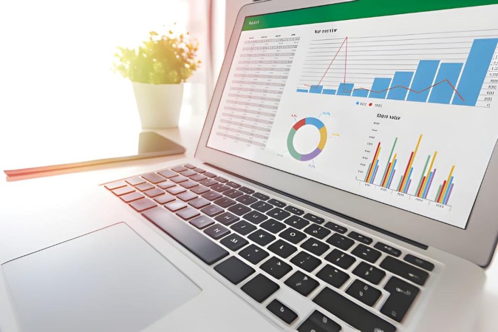
Step 7: Use Analyze Data
If you have a modern version of Excel, the Analyze Data feature can help you find quick insights. Microsoft says this feature gives high-level visual summaries, trends, and patterns from selected data. That makes it very helpful for beginners who want to explore data faster.
Analyze Data can suggest charts, summaries, and patterns without requiring much manual setup. It is a smart starting point for freshers who are still learning how dashboards work. You can use it to check which metrics matter most before building the final report. This does not replace real dashboard skills. It simply helps you work faster and learn from the data.
Step 8: Make It Manager-Friendly
A dashboard is only useful if the person reading it can understand it quickly. That is why manager-friendly design matters so much. Focus on one main message per dashboard. If the goal is sales performance, do not mix in unrelated details that confuse the story.
Ask yourself these questions:
- What does the manager need to know first?
- What number is most important?
- Which trend matters most?
- What should they act on after reading this?
If the dashboard answers those questions clearly, it will be much more effective. Good reporting is not about adding more data. It is about showing the right data.
Analyze Data can suggest charts, summaries, and patterns without requiring much manual setup. It is a smart starting point for freshers who are still learning how dashboards work. You can use it to check which metrics matter most before building the final report. This does not replace real dashboard skills. It simply helps you work faster and learn from the data.
Common Mistakes To Avoid
Many freshers make dashboards too complicated. They add too many charts, too many colors, and too many numbers. This makes the report harder to read, not better. A dashboard should be useful first and attractive second.
Another common mistake is using raw data directly without cleaning or summarizing it. That usually leads to messy visuals and wrong conclusions. Some beginners also forget to update the report layout for the viewer. A manager wants a fast summary, not a worksheet full of clutter. If you avoid these mistakes, your dashboard will already look stronger than most beginner reports.
Simple Dashboard Workflow
Here is a simple process you can follow every time:
- Clean the raw data.
- Convert it into an Excel Table.
- Create one or more PivotTables.
- Add charts based on the summaries.
- Insert slicers for quick filters.
- Arrange the dashboard neatly.
- Review the report for accuracy.
Once you repeat this process a few times, building dashboards becomes much easier. You will also start to understand which visuals work best for different kinds of data.
Why This Skill Helps Careers
Learning Excel dashboards for beginners is useful in many roles. Freshers in marketing, operations, sales, finance, HR, and admin jobs often need to create reports. If you can build a clean dashboard, you can save time and support better decision-making.
This skill also helps in interviews. Many employers like candidates who can explain data clearly and present reports with confidence. A simple Excel dashboard can show that you understand both analysis and communication.
If you want to build stronger reporting skills and learn more advanced techniques, check out our Advanced Excel course. If you need help choosing the right learning path, Contact us and we will guide you.
FAQ's
An Excel dashboard is a visual report that shows important numbers, charts, and summaries in one place.
Yes. Excel is one of the easiest tools for beginners because it helps with tables, charts, PivotTables, and filters.
Start with clean data, convert it into a table, build PivotTables, add charts, and use slicers to make the dashboard interactive.
A beginner dashboard should include key metrics, simple charts, and filters that help the viewer understand the data quickly.
No. Basic formulas, PivotTables, and charts are enough for most beginner dashboards.